Tuesday, November 15, 2016

Field Activity 9: Using ArcCollector to Gather MicroClimates

Introduction

The purpose of Field Activity 8 is to gain a working understanding of ArcCollector through the means of creating a geodatabase, deploying the project, and accessing it in ArcCollector. ArcCollector is a very useful application for mobile collecting of data in the field. It offers many of the good features of ArcGIS out in the field, all on a mobile device. This activity can help one learn how to deploy a project that is needed when group participation is needed in mapping an area without the ability to have one person go out in the field. This streamlines it and allows many to collect the data into one geodatabase.

Study Area

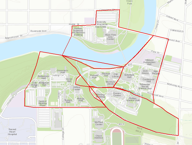
Figure 1: Study Area

The study area was the entire lower campus of UW- Eau Claire's campus. Many different groups went out to collect data in all of the delineated spaces in Figure 1. He(the writer) could not attend class, so the data was made available to him to study.


Results/Discussion


Figure 2: Temperatures collected around campus in microclimates.

The distribution of points suggests that the tree covered microclimates have a lower temperature, such as in the southeast microclimate, and part of the westernmost climate near the river. This can also be confirmed by the concentration of warmer temperatures collected near all of the buildings in the east microclimate, and the northernmost part of the southeast climate. These areas are all relatively treeless and would have less tree cover to absorb some of the radiation.

Figure 3: Dewpoints collected around campus within microclimates.
In comparison to the temperature map above, the dew point map shows trends using similar distribution techniques. The tree covered areas have higher dew points that the non-tree covered areas, which suggests that there is higher water concentration in the area because of that. This information could be used to interpolate that trees are in areas with a higher concentration of high dew points if this study were completed on a larger scale.


Figure 4: Wind Speed Collected at different micropoints around campus.
The wind speed map shows information that could be inferred from a topographic map as well. As the points get to an overlook on a higher elevation, they are higher, as well as when one is over the river, where the wind speed would be higher too.

Figure 5: Wind Direction by Angle Collected around campus 

The wind direction map is an interesting way to look at the area. The directions tend to swirl near some of the buildings, but for the most part all head N NE and then head NW when it interacts with the river.


Conclusion

ArcCollector is a very effective means to collect information. The lab shows that the maps generated from collected data is very accurate and highly informative. With a large army of people, one could collect just about anything. It is a great tool to collect information that could be displayed on maps, and solves the goals of projects when planned out effectively.


Tuesday, November 8, 2016

Field Activity 8: Navigating With a Map And Compass

Introduction

Field Activity 8 is designed to utilize maps created in Field Activity 7 to navigate through terrain at the Priory on UW- Eau Claire. The construction of maps beforehand is extremely important so that one may get an idea of what terrain they should expect when out in the field. The Priory is an extremely densely wooded area, so one should be prepared to navigate through that. Activity 7 creates topographic maps so that when one goes out in the field, they are prepared to view the terrain around them and navigate without aerial images of the study area helping them. Much like many studies, the points are pre-plotted so, having very accurate maps is important to be able to find them when a geographer goes out into the field. Having analog maps, and being able to navigate them is important because technology can always go down, and it is better to be prepared than not if one is forced to use non-technological means to complete study.

Figure 1: Study Area


Methods


Materials

  • Field Notebook
  • Pen/Pencil
  • GPS
  • Topographic maps (Field Activity 7)
  • Compass
The first step to do when one gets to the Priory is to mark down the five points that they are going to go find out in the woods (Figure 2). The GPS used is turned on, and set to UTM coordinates, to coordinated with the topographic map and the next step, which is a pace count. To accomplish the pace count, one marks out a length of 100 meters, walks down and counts their paces, walks back and counts again. Once this is completed, the person studying the area averages the two counts to discover their pace count. This is important to get an idea of distance when they are out in the field using the maps an way points to discover their location. It is a good idea to write down their pace count down on the map to remember it when they are out in the field. 

Figure 2: Field Map with points and bearing written down


The next step is to record the bearings from the starting location to the first point, and then from point to point for each point after that (Figure 2. This gives the geographer a basis to navigate through the woods, before going out. After the bearings are recorded the next step is to go start finding points. At the starting point, and each consecutive point, a person hold the compass flat at chest height and sets the bearing using the red in the shed method. After that, the a spotter int he group starts walking, counting their paces until the get to their pace count which equals 100 m, and then the group continues to follow that method, going along by an interval of 100 m, eventually getting to their point of interest. This is done to navigate all the way from the start to point 5. The GPS is consulted if one feels completely lost.

Results/ Discussion


As with most studies, the results are not as easily collected as the instructions say. Due to the incredibly dense woods of the Priory, many struggle getting through the brush without losing their direction and pace count, when it is not possible to walk in a straight line. When this happens, it is important to consult the compass to check the bearing, as that is a very good indicator of where one is going. Due to this, it becomes easy to get lost (Figure 3). For Group 1, they thought they were lost a couple times due to losing their pace count, only to be right where they should have been a couple times.


As one can see, many of the track logs weave through the study area, which indicates the difficulties experienced through the activity. Group 1's track log is different due to using a different GPS unit, which collected a line .shp file to log the track. Looking at the image, one can see many of the groups crossed each others paths, although not at the same time. For Group 1, some of the weave backs can be attributed to being ~.5 of a degree off on their bearing on one navigation to a point. This caused them to walk past their 3rd point, and eventually brought them to their fourth. From there, they walked back to the third point, which is the northern most part of their track, and then navigated to their fifth point after that. This shows that preciseness is extremely important when using any instrument to navigate, as even a tiny discrepancy can cause huge errors when the errors are expanded to much larger areas. Technology also had difficulties when importing the .txt file of the points studied. The points are imported, and transferred to xy data and they show up far off of the study area.


The UTM side of the map is extremely helpful when completing this activity. All of the points are set up in UTM, and the GPS is too, so being able to look at the three of those can be extremely helpful when way off track. The degrees decimal map was far too course to use on this course, as navigation becomes difficult when attempting to navigate that big of a grid. Next time, Group 1 would add a polygon of the starting area, as that was difficult to spot on the topographic map to start off on.

Problems

  • Group 1 members did not send the pictures of the points visited.
  • When the point .txt file was imported, the points showed up in ArcMap far south of the track logs.

Conclusion

As one can see, the construction of precise maps is very important when navigating using any instrument. Correct bearings are also extremely important, as small discrepancies can cause huge errors when magnified to much larger areas.  An important lesson one can take away from Filed Activity 8 is to always be prepared whenever they go out in the field, as it can be an immense help to have all of the details right.


Tuesday, November 1, 2016

Field Activity 7: Developing a Field Navigation Map

Introduction

Field Activity 7 is designed to facilitate the creation of field navigation maps. The class will be utilizing these field maps to conduct a survey at the Priory on the UW -Eau Claire land south of the campus the following week. The maps will be extremely important to navigate around the area, as the Priory is very wooded, so having topographic maps of the area is a very valuable resource when walking around the study area. Two field navigation maps are created for this activity, one being done with a UTM coordinate system, and one being done with a Geographic Coordinate System of Decimal Degrees. The coordinate system is very important, especially in conducting surveys, because one must have a reference to a global scale while conducting local surveys. Both maps will have grids overlaying them. The UTM coordinate system is based upon meters, so it's map has a meter based grid. The Geographic Coordinate System of Decimal Degrees is base upon degrees, so the map has a grid based upon decimal degrees. 

Methods

The first method is to open a blank map in ArcMap. The data is saved in the TEMP folder in the Q drive, so the Geodatabase for the Priory is copied over into individual student folders. The navigationboundary feature class and the priory_2ftcountours feature class are then added to the map. After this, the navigation feature class is changed to a hollow box, allowing the internal contents to be seen.The navigation maps are now ready to be created.

UTM Map

The contour must be projected to Transverse Mercator to properly line up with the navigation boundary for the UTM map. This allows a meter-based grid to be overlayed to help create a navigation map. The map is then changed from data view to layout view. This allows a grid and other map elements to be inserted into the map. Before anything else is done, the page setup must be changed to 11x17 inches to create a map that can be printed. The data frame is then fit to the new view. To create a new grid, one must right-click on the current data frame and got to properties. From there, Grids is selected. New Grid is selected to create an overlay. For UTM, Measured Grid is selected. Leave Grid and labels selected, and in the intervals, change the X Axis and Y Axis values to smaller values such as 50 and 50. Leave the next page as the defaults and click finish. Next re-open the Grid page within the data frame properties. Selected the measured grid just created and select properties from the right menu. Go to labels and make sure the Label Style Format is in Mixed Font. Change the font size to 6. From there, go to Additional Properties and select "Group by decimal point" and change the font color to light grey. Click okay on all boxes to exit out back to the map. After this, add other map elements such as: North Arrow, scale bar and reference scale, the projection, coordinate system, data source, watermark with the makers name, and a title.

Decimal Degrees Map

The decimal degrees map does not need to be projected, as the grid will be based upon the coordinate system. Change the map from data view to layout view, and change the page size to 11x17 within the page and print setup. Refit the data frame to the new size to begin. To create a new grid, one must right-click on the current data frame and got to properties. From there, Grids is selected. New Grid is selected to create an overlay. To create the Decimal Degrees map, Graticule is selected, as the grid will be based upon latitude and longitude. To create a navigation map for an area as small as the Priory, change the X Axis and Y Axis intervals to 5" each. Leave the next pages as the default and click finish on the last page. From there, select the graticule grid just created, and select properties. Select Labels, and ensure the Label Style Format is in Degrees Minutes Seconds. Once that is done, change the font size to 6. Then select Additional Properties and make sure the Label Type is Standard. Click okay to close out of all the boxes back to the map. After this, add other map elements such as: North Arrow, scale bar and reference scale, the projection, coordinate system, data source, watermark with the makers name, and a title.


Results


Figure 1: UTM based map.


Figure 2: Decimal Degrees map.

Tuesday, October 25, 2016

Field Activity 6: Conducting a Distance Azimuth Survey

Introduction

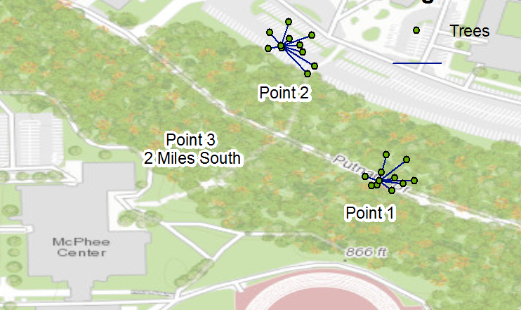
The point of Field Activity 5 is to create a field survey using azimuth angles and distance between oneself and the object being surveyed. This is extremely important when one has no other form of survey techniques available, such as a survey GPS. The field activity's main purpose is to collect a tree survey of Putnam Park in UW -Eau Claire. It is done without a survey GPS, and completed with just basic technologies. Data normalization is incredibly important when working with different groups of surveyors, so the process for creating fields in Field Activity is as follows: x, y, distance, azimuth, diameter at breast height (DBH), tree type, and the point number. This facilitates the correct data entry among different groups of people at different locations. The "X" field is longitude, the "Y" field is latitude, the azimuth is the angle to the tree being surveyed form the surveyor, distance is the distance in meters to the tree, DBH is diameter in cm, tree type identifies the type of tree, and the point number is the different locations a survey is collected.

Figure 1: Black box indicates study area of tree survey
The first point of study by the Geog. 336 class is important because it provides a base point for the rest of the study. The other two points should be collected, and reviewed to make sure that the latitude and longitude make sense spatially.

Methods


Materials

  • Hand Held GPS locator
  • Rangefinder
  • Tree Diameter Tape
  • Compass
  • Field Notebook


Figure 2: Collecting the azimuth (right) and the distance (left).
The first step is to work as a class to collect the first set of ten trees at Point 1, where the class starts. The GPS point is collected and used to enter all of the data for the ten trees being collected. Someone then uses the compass to find the azimuth angle to a certain tree. Once that is completed, someone uses the rangefinder to shoot the distance to the tree being surveyed to collect the distance in meters (Figure 2). Another person then uses the diameter tape to collect the diameter at breast height, which is important because the tree could have abnormalities lower down, so breast height is a good normalization technique (Figure 3). Once this is done, the tree is identified and logged in the data notebook. The notebook is important because in an azimuth distance survey, there is a good chance that there will be no technology connection to satellites to log the data. The point number is also logged for each tree as 1. Once this is done, different groups go to two other points away from the base point to collect more data for ten trees at each point. 


Figure 3: Collecting the DBH.

The next step is to enter all of the data into an Excel spreadsheet in the appropriate fields. This is then imported into ArcMap by creating a geodatabase for the survey. Once this is done, right click on the GDB and select import Table(single). Select the table to import and enter in the appropriate fields. The next step is to use Bearing Distance to Line command in Data Management->Features. This is used to input the table into lines from each point. The feature class is then input into the Feature Vertices to Points command within the same folder of geoprocesses. This creates the points of each tree. Once these feature classes are added to a blank map, a base map is added.

Results/ Discussion


Figure 4: Final Survey Map 


The data is created to show the different trees that are surveyed (Figure 4). The points all show the correct distances and azimuths to each tree. There are, however, difficulties that happen in this survey. The points are collected beneath a ridge by the UW -Eau Claire campus, so all of the GPS points are off in the initial table. 


Figure 5: Initial map created from data.


The intial points are all off, so the identifier tool has to be used to collect the right lat and long of the actual points. The table is edited to reflect this create the final map (Figure 4). The hand written data works exceptionally well with the other technologies at hand. Although the data was wrong at first in the x and y field, this did not create too much of a problem for creating the final map. This method is effective if no other option is available.

Conclusion

This was a very effective distance azimuth survey. Although some of the data was wrong initially, identifying the correct lat and long is not a big issue. It is different from a survey that would be completed with a survey GPS, as all of the measurement is done by hand, including the distance and azimuth of each tree from each point. For simple surveys such as tree collection, the distance azimuth survey is effective.


Tuesday, October 18, 2016

Field Activity 5: Visualizing Survey Data

Introduction

In the last field activity, group 1 set out to create a digital elevation model (DEM) by collecting data points within a 1 m x 1 m sandbox. The group collected elevation points using a stratified sampling system that also had systematic sampling techniques applied as well. Once the survey was completed, the data was entered into a spreadsheet to be imported into ArcGIS to be mainpulated into the DEM. An important aspect to complete field activity 5 was data normalization. Data normalization was important for group 1 because in order to create a DEM, the data has to be organized properly. This organization allows groups to reduce data redundancy and helps to improve the integrity of the data. For group 1, data normalization was accomplished by creating three columns in a spreadsheet with the field names: "X_Cell", "Y_Cell", and "Z_Value". The X cell corresponds to the x value of the sandbox grid. The Y Cell corresponds to the y value of the sandbox, and the Z Value corresponds to the elevation points collected at each point. This organization allows the data to be imported  fairly easy, with the names already correlating to geoprocessing techniques within ArcGIS. The data points group 1 collects are used to facilitate interpolated processes that allows ArcGIS to create a DEM very efficiently. The interpolation procedure takes in the collected data points and creates new points around the known points through a variety of different methods.


Methods

The first step group 1 took to complete the activity was tom import the Excel file with all of the data points into a Geodatabase for the sandbox. The fields were double checked to be numeric, as this allows the points to be converted into data usable for map creation. The data is then added to a blank map in ArcMap as "XY data'. This allows one to convert the points brought in to a feature class that is usable for interpolation later. The next step the group took was to utilize the 'Raster Interpolation' within the 3D Analyst Geoprocessing tools to create maps that replicate the intended terrain.

Figure 1: Actual Sandbox Terrain with Amanda adding detail to sand.


The first interpolation utilized by group 1 is Inverse Distance Weighted (IDW). This method averages points in each neighborhood of a cell, and then weights out the priority of veraging to determine the value each point is given (Figure 2). This method was very successful for the group, as many of the data points were collected in the center of cells, so the output image brought a very realistic image of the terrain to a DEM. The 

Figure 2: IDW Interpolation Result

The next method employed by the group was the Natural Neighbor interpolation procedure. It is also known as the "area-stealing" interpolation, as it applies only local values, and establishes a weight that creates a value for each point around the surface. The natural neighbor interpolation provided perhaps the most realistic model of the terrain in the sandbox (Figure 3).

Figure 3: Natural Neighbor Interpolation Result

The third method employed by group 1 in interpolation was the Kriging interpolation process. It uses regionality to establish Z-value patterns throughout the surface, without employing any other method. It assumes the surface is homogeneous, and the same pattern of values are observable at all locations on the terrain. It did not due to well to describe the data collected by group 1 (Figure 4). It centered too much weight around the plateau in the lower right corner of the terrain, and did not do a good job at describing the mountain ridges.

Figure 4: Kriging Interpolation Result

The fourth method employed by group 1 was the Spline interpolation (Figure 5). It utilizes a mathematical function to minimize surface curvature, which in turn maximizes the smooth surface of a surface. It assesses all sample points, and fins the curvature between them. The spline interpolation method did not work well for the data, as it focused very heavily on the data points that were clustered, and formed terrains that were over-exaggerated.

Figure 5: Spline Interpolation Result
The final interpolation method that group 1 employed was the TIN surface. This method employs triangular networks set up between the data points collected. It connects all of the lines to create triangles, which create a network of shapes that resemble the surface. The TIN method worked very well for the data group 1 collected (Figure 6). It portrays all of the various terrains very effectively.


Figure 6: TIN Interpolation Result


The data was manipulated to bring into ArcMap, as the 3D visuals are not apparent in anything but ArcScene and ArcGlobe. To create the scene in ArcScene, the data was interpolated using the various methods. The properties of each individual file is then changed to set the elevation from surfaces to "Floating on a custom surface" to create the 3D effect. Once this is done, one can change the data frame properties of each map to "Calculate From Extent" selection of the vertical exaggeration. This creates the proper scene for analyzing the data. Once the scene is set, the shapefile can be saved as a layer file, and captured as an image. This allows one to open up the two in conjunction with each other in ArcMap to overlay a legend and map properties upon the image. The image was chosen to be landscape orientation, as it displays images such as these the best way.

Results/ Discussion

The best interpolation method for group 1 was the natural neighbor system (Figure 3). It created very accurate local points that portrayed an image that resembled the original sandbox terrain quite accurately. There were very few unaccurate points of the survey. They will be discussed in this section.

Overall, the IDW interpolation provided a very good image of what the sandbox studied looked like. I captured every feature of the box quite well, however the spacing between points portrayed a skewed data set. It did not display the sandbox as a continuous terrain. This could probably be solved by collecting more data points to create a more fluid picture of the terrain. The natural neighbor provided an excellent DEM. It was able to portray the terrains of the different regions with clarity and quality. The only way to make the interpolation more effective would have been to collect more points in different areas. The Kriging interpolation was very poor to represent the groups data. It did not account for the mountain ridge in the sandbox, and created the plateau as a very high hill. This is most likely because the plateau had a key chain size llama on it that the group also collected (which appeared in different interpolations). The spline interpolation was also poor, most likely due to the high concentration of points near the llama shrine again. It provided a good image of the regional if one were to "read between the lines" and see the spots that the reduced curvature removed. The TIN provided an excellent interpolation for the data. The method allowed the data to create well-done triangles that portrayed the terrain as it is. Like the Natural Neighbor interpolation, the TIN scene could have been much better if many more data points were collected to create a continuous data set. Overall, each of the interpolations could have been successful to view the data as a DEM if necessary. The features alone create a very interesting method to collect data. This field activity allowed group 1 to create an effective DEM off of the last field activity in which they collected the data.

Conclusion

This survey was a very effective stratified sampling system. This survey is like other stratified sampling systems in that it collected the elevations of locations, be it for engineering or otherwise. It is different because it was collected using a meter stick rather than a survey GPS. It is not always realistic to perform a grid based system to collect data, as it could intrude upon private land, or buildings one can not enter. A stratified system with a grid influence is probably the best bet for most collection, as it can account for other influences that don't always come up in planning.

Tuesday, October 11, 2016

Field Activity 4: Digital Elevation Surveying

Introduction

Sampling is a scientific collection method that involves precise measurement of small portions of a large study. It is very important to sample, especially when studying areas of the earth. Sampling allows a study to be completed faster, more efficiently, and saves many resources in the process of creating a valid sample of the entire study area. There are three types of sampling used; random, systematic, and stratified. Random sampling use completely random location collecting. It is completely unbiased, where everything within the study has an equal chance to be selected. It can also be a bad choice to sample a study randomly if large areas within the study are not being sampled. Systematic sampling uses a regular, evenly distributed interval of the study to collect samples. Things such as a grid, or lines of study can be used to achieve a systematic sampling system. It is good to do very straight forward data collection, but can be biased in collection. Stratified sampling is the third sampling method. It uses known groups of a study, and collects data points according to the size of the groups in the study. It can be done in concurrence with the other sampling techniques, and can generate good data that represents the entire study. It can be bad when the groups of the data are not known, as this generates skewed data.

The lab's objective is to accurately construct an elevation surface of a terrain. The study will be completed using a 1 m x 1 m sandbox that students will construct a landscape within using sand to create a unique terrain. This terrain will then be sampled using the sampling method of choice by the students and entered into a spreadsheet to be used for creating a DEM in ArcGIS.


Methods

The sampling method chosen by group 1 was to create a sample using a stratified sampling technique, with a systematic sampling grid to create an easier sample collection. This became effective when the group ran into time constraints, and needed to collect data in a timely matter. This is similar to a systematic sampling method, but involves the shape of the terrain within the study area mapped out as "groups" within the larger area. The sample plot is located near the University of Wisconsin -Eau Claire's Phillips Building. It is directly across the East side of Roosevelt St in a yard of a local resident. The sample plot studied by the group was the western box of the two (Figure 1).


Figure 1: Completed sandbox set-up that includes a forest to the east, prairie lands to the west, and various terrains in between.

Materials Used

  • Meter Sticks
  • String
  • Thumb Tacks
  • Data Collection Notebook
  • Pencil
  • Samsung Galaxy S6 Edge
The sampling scheme was set up using a grid with roughly 10 cm spaces between each reference point on the x and y axis. The sea level was decided to be at the top of the box. Strings were then set up as a spatial reference point at each x and y point to draw over the grid the rough drawing of the elevation model. This allowed group 1 to create a stratified system of equal groups within the model that streamlined the data collection (Figure 2).

Figure 2: Creating a Sampling technique.
Once this was set up, elevation points were collected using a meter stick to collect to data of elevation compared to the sea level (0 cm point). It was entered directly onto the drawn sampling grid (Figure 3). This created a good system for the group to complete the task at hand.


Figure 3: Drawn out sampling method.


Results/ Discussion

In total, there were 178 data points collected using the stratified method. They ranged from very low in the deepest part of the depression to very high on the highest peak. The prairie lands have similar values throughout much of the western portion of the sample.

Minimum: -16 cm
Maximum: 12 cm
Mean Elevation: -4.71 cm
Standard Deviation: 4.64 cm

Figure 4: An example of the collected data.
The sampling method was effective for the group. It became more effective when the group decided to use the string to print lines across the sand box to easily view the cells. The biggest problem for group 1 was the fact that the group only included 2 students, so moving the data points, collecting the data, and writing it was difficult to do between 2 people.


Conclusion

The sampling method deployed by the group utilized a good stratified system that allowed the students to involve a systematic sampling approach to the data collection. One must always consider sampling spatial situations as the time and resources saved become very valuable when a sample can be as efficient as possible. This same sampling technique could be deployed in a much large area to collect data, when the time used to collect the data is amplified many times over. This survey did a very good job of collecting data and the DEM created on ArcGIS will show if the methods were successful. One could add the strings across the whole plot to view the data much more clearly when collecting.

Tuesday, October 4, 2016

Field Activity 3: Creating a GIS for Hadleyville Cemetery

Introduction

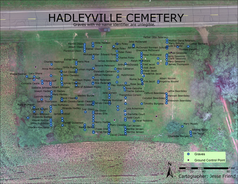
Field activity 3 is designed to facilitate the creation of a GIS for Hadleyville Cemetery. In previous avtivities, students collected data from Hadleyville Cemetery using handwritten notes and a UAS survey drone. Activity 3 is designed to bring all of the data together to create a visual GIS for the county of Eau Claire to distribute for the cemetery. This activity is important because the cemetery does not currently hold all of the records for the burial plots anymore. Thus, a map with all of the data is very important for them to know the current status of the cemetery. Each burial plot point on the map created holds all of the known information of the grave site such as name, year of birth, year of death, condition, and any other attributes available from the headstone. 

Study Area

Hadleyville Cemetery is located in the town of Pleasant Valley. The official address of it is County Road HH, Section 04, Twn 25N, Range 9W. It is on the south side of the road, and is about 1 block west of S Lowes Creek Rd. Figure 1 shows the location within the County of Eau Claire.
Figure 1: Location of cemetery within Eau Claire County. (1)

Methods

The class used a combination of hand-written notes and aerial data collection to create a GIS for this project. Dr. Hupy flew the UAS over the cemetery to get a good aerial picture of the parcel for mapping. 5 bands of em were collected to help view the headstones in different light. The mm accuracy of the drone allowed people to drop a point directly onto the burial plots within the cemetery. Once this was done, the class created a Google spreadsheet o all of the data collected to eventually save as an excel file. This allowed the class to collaborate on data collection, and create a hard copy of the information so that it could be reviewed by all before it was published. After the spreadsheet had been made, the class made GIS' of the images with points on each grave corresponding to the knowledge of the hand-written data. This was then table joined to the excel table in arcmap (see Figure 2). This process was very quick and allowed the class to streamline the process to create a GIS. Once this was completed, an aesthetically pleasing map was created of the results (see Figure 3).
Figure 2: Portion of Grave attribute table/

Results/Discussion

Figure 3: Resultant map with graves plotted out.

Overall the method was very efficient. The class originally planned on taking a survey GPS out into the field to collect all of the data points, but due to bad tree cover and time spent creating the points, the hard copy notes, and heads-up digitizing proved to be the most efficient method of creating a successful GIS. One way the class could have refined the method would have been to count the headstones in each row to get a definitive number before collecting the data. Assigning the correct number of headstones was a difficult task for the class on the spreadsheet. This would have allowed the class to plan out how the graves would have been divied up, and would have provided a much smoother data collection.

Conclusion

The methods transferred well to the overall objectives. The mixed format of data collection allowed the class to expedite the project very quickly and accurately, and provided a means for collaboration. The potential errors should be reviewed, but are most likely negligible to the overall final product. The GIS created provides a clean, accurate source of data for the county and is a successful product. If all goes well, this GIS should be able to be kept in use for as long as the county can keep tack of it.

  Citations

1) Wikipedia Page on Hadleyville Cemetery https://upload.wikimedia.org/wikipedia/en/f/f5/Hadleyville%2C_Wisconsin.png