Introduction
The field activity's purpose is to acclimate oneself with using a dual frequency survey GPS to collect points and create a continuous surface raster layer with the data collected. The topographic survey is meant to get students comfortable using the equipment in the field, using a recognizable land feature to visualize the results before bringing the points into ArcGIS.
Methods
STUDY AREA
 |
| Figure 1: Study Area of the hill |
The survey is completed by bringing a dual frequency GPS out to the hill in the center of campus of UW-Eau Claire. From there, students get in groups of three and take turns operating the GPS to collect points all along the hill to gather a comprehensive topographical survey. This is done by leveling the GPS receiver, and collecting the point on the survey GPS hand held touch screen. After the points are collected, the students go back to the lab to import a .txt file of the data into an xcel file. From there, the excel file is imported into ArcScene as a table. This table is then turned into xy data points, using the tool. From there, a variety of interpolations are completed to create a raster output image of the hill to be viewed in 3D.
 |
| Figure 2: Using the Dual Frequency GPS. |
Results
After the interpolations were ran, different results showed the data collection through different lenses. This was completed because of the different interpolation methods ran create the points between the points in different ways. The best interpolations for the students were probably the TIN and Natural Neighbor interpolation. The outcomes were very similar to the sandbox field activity completed in terms of quality of actual representation.
 |
| Figure 3: IDW Interpolation Result |
The IDW result weighted the high point too much, which created a little tip in the center of the top of the hill. Other than the point, the rest of the hill was mapped fairly well.
 |
| Figure 4: Kriging Interpolation Result |
The Kriging interpolation was a pretty good representation of the hill. It has a fairly gradual slope down, which imitates the actual hill very well.
 |
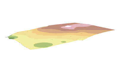
| Figure 5: Natural Neighbor Interpolation Result |
The Natural Neighbor interpolation result is probably the second best interpolation for the various results. It used the outermost points to create a polygon that shows the actual shape of the hill that students naturally gravitated to to collect points around the size of the hill. The slope is represented fairly well too.
 |
| Figure 6: Spline Interpolation Result |
The Spline interpolation was probably the worst representation of the topographic survey. It created much more dramatic inclines and slopes than were actually there.
 |
| Figure 7: TIN Interpolation Result |
Conclusion
The field activity was very good to gain an understanding of how a dual frequency survey GPS works. These skills can be transferred to real world experience when working in the field. The technology worked very well for this activity, and allowed for a thorough completion of the topographic survey.
No comments:
Post a Comment