Tuesday, December 20, 2016

Field Activity 12: Processing UAS Data with Pix4D

Pix4D Overview

Pix4D is a drone photogrammetry software that uses images to create point clouds, DSMs, orthomosaics and more. It is a survey workflow that allows for a variety of professional fields such as; construction, agriculture, and real estate to access quality software for analyzable results. Users can utilize Pix4D with any camera, photo, or it's app, Pix4Dcapture, to generate data that is easily shareable. It is available online or offline so no internet connection is needed.


Pix4D FAQs


  • What is the overlap needed for Pix4D to process imagery?
It is recommended that users have at least 75% frontlap and 60% sidelap.

  • What if the user is flying over sand/snow, or uniform fields?
With snow and sand in uniform areas, 85% frontlap and 70% sidelap is recommended.

  • What is Rapid Check?
Rapid check is a fast processing method that creates a visual surface very fast but with low resolution. This is great for field workers who need a quick check to view their work.

  • Can Pix4D process multiple flights? What does the pilot need to maintain if so?
Yes, Pix4D is capable of processing multiple flights. The pilot needs to maintain the same vertical and horizontal coordinate system throughout the whole project if they wish to merge multiple flights.

  • Can Pix4D process oblique images? What type of data do you need if so?
Pix4D can process oblique images. It is recommended to take images every 5-10 degrees if doing so, as well as capturing two sets of data at different heights.

  • Are GCPs necessary for Pix4D? When are they highly recommended?
GCPs are not necessary for Pix4D, but they are highly recommended especially when a project has no geolocation

  • What is the quality report?
The quality report is the description of how the data displayed after the initial processing. It gives a summary of the entire dataset, and how good of a quality result it processed in.


Using Pix4D/Methods 


When Pix4d is opened, Projects is clicked so that one can open a New Project. Name the project something relevant, hopefully coordinating with a naming convention, and save it where it can be found later. From there, the "Select Images" screen opens up. At this point, all of the flight image files collected with a drone can be added. Click on one image, and then hold shift and click the last image in a folder to add all images at once. Click "Next" once this is done, review the Image Properties, and within that page select "Edit" within the camera model to change the Shutter Model to Linear Rolling if the camera model used collects images this way. Click "Next" and review the Output Coordinate System page to ensure accuracy. Click Next and select the type of processing to be completed. In this case, it will be "AG RGB". Creating a study area can be helpful to make processing faster. To do this, select "Map View" and then select Processing Area and delineate the area wanted to study. When first running the processing, only select "1. Initial Processing" to view to data's quality before the rest of the processing can occur. This will generate a Quality Report to be viewed to ensure that quality is high enough to process. Once this is reviewed, the point cloud mesh and dsm, orthomosaic  and index can be processed.

CALCULATING AREA OF A SURFACE

1. Select the view
2. Select the rayCloud
3. Select New Surface
4. Click to select vertexes, and right click to finalize polygon

MEASURE LENGTH OF A DISTANCE

1. Select the view
2. Select rayCloud
3. Select New Polyline
4. Click to select distance to be measured

CALCULATE VOLUME OF 3D OBJECTS

1. Select view
2. Select volumes
3. Select New Volume
4. Click the vertexes around the object and right click to finish the object shape

CREATE A FLY-BY ANIMATION

1. Select view
2. Select rayCloud
3. Select the camera icon from the create box
4. Either choose User Generated Waypoints or Computer Generated Waypoints
5. Select the duration and speed of the flight
6. Save the file using the browse button
7. Render the video to save the file


Results


Figure 1: Mosaic image with the shapfiles of the distance, volume, and area calculation over-layed.


Figure 2: DSM result of Pix4D processing.


Figure 3: Fly-By Animation of entire captured area.


Pix4D Review


Pix4D is a great program for processing UAS imagery. Even those who have no knowledge of geographic skills could have a basic understanding of how to use the program. It creates high quality output with relative ease, and those who spend time getting to know how to use the ins and outs of Pix4D could create incredibly accurate photos for a variety of different professional applications. It may not be as accurate as LiDAR, but using the processing tools can make output that is usable if LiDAR is not accessible. 


Tuesday, December 6, 2016

Field Activity 11: Surveying Points Using a Dual Frequency GPS

Introduction

The field activity's purpose is to acclimate oneself with using a dual frequency survey GPS to collect points and create a continuous surface raster layer with the data collected. The topographic survey is meant to get students comfortable using the equipment in the field, using a recognizable land feature to visualize the results before bringing the points into ArcGIS. 


Methods


STUDY AREA

Figure 1: Study Area of the hill
The survey is completed by bringing a dual frequency GPS out to the hill in the center of campus of UW-Eau Claire. From there, students get in groups of three and take turns operating the GPS to collect points all along the hill to gather a comprehensive topographical survey. This is done by leveling the GPS receiver, and collecting the point on the survey GPS hand held touch screen. After the points are collected, the students go back to the lab to import a .txt file of the data into an xcel file. From there, the excel file is imported into ArcScene as a table. This table is then turned into xy data points, using the tool. From there, a variety of interpolations are completed to create a raster output image of the hill to be viewed in 3D.


Figure 2: Using the Dual Frequency GPS.


Results


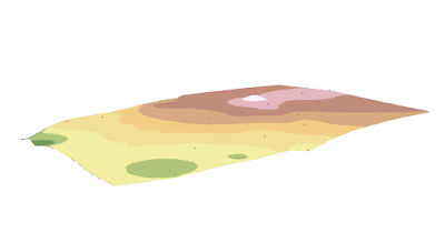
After the interpolations were ran, different results showed the data collection through different lenses. This was completed because of the different interpolation methods ran create the points between the points in different ways. The best interpolations for the students were probably the TIN  and Natural Neighbor interpolation. The outcomes were very similar to the sandbox field activity completed in terms of quality of actual representation.

Figure 3: IDW Interpolation Result

 The IDW result weighted the high point too much, which created a little tip in the center of the top of the hill. Other than the point, the rest of the hill was mapped fairly well.

Figure 4: Kriging Interpolation Result

The Kriging interpolation was a pretty good representation of the hill. It has a fairly gradual slope down, which imitates the actual hill very well.

Figure 5: Natural Neighbor Interpolation Result

The Natural Neighbor interpolation result is probably the second best interpolation for the various results. It used the outermost points to create a polygon that shows the actual shape of the hill that students naturally gravitated to to collect points around the size of the hill. The slope is represented fairly well too.

Figure 6: Spline Interpolation Result

The Spline interpolation was probably the worst representation of the topographic survey. It created much more dramatic inclines and slopes than were actually there.

Figure 7: TIN Interpolation Result
The TIN results were on par with the Natural Neighbor results in terms of quality. It created the actual shape of the hill, and provided a gentle slope where necessary, and more steep areas where the hill changed elevation much faster.


Conclusion

The field activity was very good to gain an understanding of how a dual frequency survey GPS works. These skills can be transferred to real world experience when working in the field. The technology worked very well for this activity, and allowed for a thorough completion of the topographic survey.

Tuesday, November 29, 2016

Field Activity 10: Developing and Deploying an ArcCollector App

Introduction

The field activity is intended to deploy an ArcCollector app that can help to answer a geographically based question. The objectives are to fully understand what goes into the back end of a geodatabase, and how to replicate the results later on in life. The question at hand for this project is: What houses need to be serviced for the Office of Sustainability's $core Program. This program goes to student housing in Eau Claire and rates their housing on different levels of sustainability. This app will help them to identify the houses they need to service, as well as give them a good background of information before they do. The proper design is important for developing the geodatabase, because every field must be populated with the correct data, and so developing each domain along the way must be very accurate 

Study Area

The study area was all of Eau Claire, as student housing can be almost anywhere in the city. 

Figure 1: The study area of Eau Claire.


Methods

The first step was to create a geodatabase to deploy later on to ArcGIS online. The next step is to create the domains that will be used for the fields in the feature class. After this is done, a feature class is created to store the data, and all of the fields are generated to allow for proper data collection. 


Figure 2: Geodatabase creation, along with domains.

As Figure 2 shows, the SCORE.gdb in the top left shows the geodatabase ready to launch. The main viewer in the figure shows all of the domains in creation. The geodatabase is then shared to the to ArcGIS online as a service. At this point data collection in the field is possible.

Results/ Discussion


<style>.embed-container {position: relative; padding-bottom: 80%; height: 0; max-width: 100%;} .embed-container iframe, .embed-container object, .embed-container iframe{position: absolute; top: 0; left: 0; width: 100%; height: 100%;} small{position: absolute; z-index: 40; bottom: 0; margin-bottom: -15px;}</style><div class="embed-container"><iframe width="500" height="400" frameborder="0" scrolling="no" marginheight="0" marginwidth="0" title="Score Online" src="//uwec.maps.arcgis.com/apps/Embed/index.html?webmap=973797d0b24242f4ad6cbcb841815898&amp;extent=-91.6084,44.7622,-91.3975,44.8455&amp;zoom=true&amp;scale=true&amp;disable_scroll=true&amp;theme=light"></iframe></div>
Figure 4: Real time map results.


As Figure 3 shows, most of the points are near UW-Eau Claire. In fact, every point but one is within a one mile distance to the campus. This shows trend correlates to the fact that most student housing is concentrated along water street. This is also just a preliminary finding, but the trend would suggest that if more points were added to the map service, it would show similar findings. One suggestion for fixing, is for the Apt # field. The long integer did not allow for decimals, and most apartments with an apartment number were 1/2, or letters such as a or b. In this case, a solution could be to go back and change the field to text and limit it to 4 characters. The embedded map, Figure 4, also did not work.

Conclusion

The need for proper project design is very important. A project cannot be completed if the design does not allow for the work to be done correctly. The question of what houses need to be serviced was answered pretty clearly, and gives $core workers a good idea of where they need to go when they go out into the field to service these houses. If this were to be made into a bigger project, Survey123 would be a good alternative, as it provides a good interface for the project at hand.

Tuesday, November 15, 2016

Field Activity 9: Using ArcCollector to Gather MicroClimates

Introduction

The purpose of Field Activity 8 is to gain a working understanding of ArcCollector through the means of creating a geodatabase, deploying the project, and accessing it in ArcCollector. ArcCollector is a very useful application for mobile collecting of data in the field. It offers many of the good features of ArcGIS out in the field, all on a mobile device. This activity can help one learn how to deploy a project that is needed when group participation is needed in mapping an area without the ability to have one person go out in the field. This streamlines it and allows many to collect the data into one geodatabase.

Study Area

Figure 1: Study Area

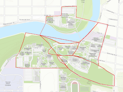
The study area was the entire lower campus of UW- Eau Claire's campus. Many different groups went out to collect data in all of the delineated spaces in Figure 1. He(the writer) could not attend class, so the data was made available to him to study.


Results/Discussion


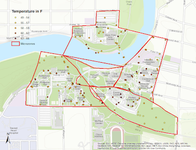
Figure 2: Temperatures collected around campus in microclimates.

The distribution of points suggests that the tree covered microclimates have a lower temperature, such as in the southeast microclimate, and part of the westernmost climate near the river. This can also be confirmed by the concentration of warmer temperatures collected near all of the buildings in the east microclimate, and the northernmost part of the southeast climate. These areas are all relatively treeless and would have less tree cover to absorb some of the radiation.

Figure 3: Dewpoints collected around campus within microclimates.
In comparison to the temperature map above, the dew point map shows trends using similar distribution techniques. The tree covered areas have higher dew points that the non-tree covered areas, which suggests that there is higher water concentration in the area because of that. This information could be used to interpolate that trees are in areas with a higher concentration of high dew points if this study were completed on a larger scale.


Figure 4: Wind Speed Collected at different micropoints around campus.
The wind speed map shows information that could be inferred from a topographic map as well. As the points get to an overlook on a higher elevation, they are higher, as well as when one is over the river, where the wind speed would be higher too.

Figure 5: Wind Direction by Angle Collected around campus 

The wind direction map is an interesting way to look at the area. The directions tend to swirl near some of the buildings, but for the most part all head N NE and then head NW when it interacts with the river.


Conclusion

ArcCollector is a very effective means to collect information. The lab shows that the maps generated from collected data is very accurate and highly informative. With a large army of people, one could collect just about anything. It is a great tool to collect information that could be displayed on maps, and solves the goals of projects when planned out effectively.


Tuesday, November 8, 2016

Field Activity 8: Navigating With a Map And Compass

Introduction

Field Activity 8 is designed to utilize maps created in Field Activity 7 to navigate through terrain at the Priory on UW- Eau Claire. The construction of maps beforehand is extremely important so that one may get an idea of what terrain they should expect when out in the field. The Priory is an extremely densely wooded area, so one should be prepared to navigate through that. Activity 7 creates topographic maps so that when one goes out in the field, they are prepared to view the terrain around them and navigate without aerial images of the study area helping them. Much like many studies, the points are pre-plotted so, having very accurate maps is important to be able to find them when a geographer goes out into the field. Having analog maps, and being able to navigate them is important because technology can always go down, and it is better to be prepared than not if one is forced to use non-technological means to complete study.

Figure 1: Study Area


Methods


Materials

  • Field Notebook
  • Pen/Pencil
  • GPS
  • Topographic maps (Field Activity 7)
  • Compass
The first step to do when one gets to the Priory is to mark down the five points that they are going to go find out in the woods (Figure 2). The GPS used is turned on, and set to UTM coordinates, to coordinated with the topographic map and the next step, which is a pace count. To accomplish the pace count, one marks out a length of 100 meters, walks down and counts their paces, walks back and counts again. Once this is completed, the person studying the area averages the two counts to discover their pace count. This is important to get an idea of distance when they are out in the field using the maps an way points to discover their location. It is a good idea to write down their pace count down on the map to remember it when they are out in the field. 

Figure 2: Field Map with points and bearing written down


The next step is to record the bearings from the starting location to the first point, and then from point to point for each point after that (Figure 2. This gives the geographer a basis to navigate through the woods, before going out. After the bearings are recorded the next step is to go start finding points. At the starting point, and each consecutive point, a person hold the compass flat at chest height and sets the bearing using the red in the shed method. After that, the a spotter int he group starts walking, counting their paces until the get to their pace count which equals 100 m, and then the group continues to follow that method, going along by an interval of 100 m, eventually getting to their point of interest. This is done to navigate all the way from the start to point 5. The GPS is consulted if one feels completely lost.

Results/ Discussion


As with most studies, the results are not as easily collected as the instructions say. Due to the incredibly dense woods of the Priory, many struggle getting through the brush without losing their direction and pace count, when it is not possible to walk in a straight line. When this happens, it is important to consult the compass to check the bearing, as that is a very good indicator of where one is going. Due to this, it becomes easy to get lost (Figure 3). For Group 1, they thought they were lost a couple times due to losing their pace count, only to be right where they should have been a couple times.


As one can see, many of the track logs weave through the study area, which indicates the difficulties experienced through the activity. Group 1's track log is different due to using a different GPS unit, which collected a line .shp file to log the track. Looking at the image, one can see many of the groups crossed each others paths, although not at the same time. For Group 1, some of the weave backs can be attributed to being ~.5 of a degree off on their bearing on one navigation to a point. This caused them to walk past their 3rd point, and eventually brought them to their fourth. From there, they walked back to the third point, which is the northern most part of their track, and then navigated to their fifth point after that. This shows that preciseness is extremely important when using any instrument to navigate, as even a tiny discrepancy can cause huge errors when the errors are expanded to much larger areas. Technology also had difficulties when importing the .txt file of the points studied. The points are imported, and transferred to xy data and they show up far off of the study area.


The UTM side of the map is extremely helpful when completing this activity. All of the points are set up in UTM, and the GPS is too, so being able to look at the three of those can be extremely helpful when way off track. The degrees decimal map was far too course to use on this course, as navigation becomes difficult when attempting to navigate that big of a grid. Next time, Group 1 would add a polygon of the starting area, as that was difficult to spot on the topographic map to start off on.

Problems

  • Group 1 members did not send the pictures of the points visited.
  • When the point .txt file was imported, the points showed up in ArcMap far south of the track logs.

Conclusion

As one can see, the construction of precise maps is very important when navigating using any instrument. Correct bearings are also extremely important, as small discrepancies can cause huge errors when magnified to much larger areas.  An important lesson one can take away from Filed Activity 8 is to always be prepared whenever they go out in the field, as it can be an immense help to have all of the details right.


Tuesday, November 1, 2016

Field Activity 7: Developing a Field Navigation Map

Introduction

Field Activity 7 is designed to facilitate the creation of field navigation maps. The class will be utilizing these field maps to conduct a survey at the Priory on the UW -Eau Claire land south of the campus the following week. The maps will be extremely important to navigate around the area, as the Priory is very wooded, so having topographic maps of the area is a very valuable resource when walking around the study area. Two field navigation maps are created for this activity, one being done with a UTM coordinate system, and one being done with a Geographic Coordinate System of Decimal Degrees. The coordinate system is very important, especially in conducting surveys, because one must have a reference to a global scale while conducting local surveys. Both maps will have grids overlaying them. The UTM coordinate system is based upon meters, so it's map has a meter based grid. The Geographic Coordinate System of Decimal Degrees is base upon degrees, so the map has a grid based upon decimal degrees. 

Methods

The first method is to open a blank map in ArcMap. The data is saved in the TEMP folder in the Q drive, so the Geodatabase for the Priory is copied over into individual student folders. The navigationboundary feature class and the priory_2ftcountours feature class are then added to the map. After this, the navigation feature class is changed to a hollow box, allowing the internal contents to be seen.The navigation maps are now ready to be created.

UTM Map

The contour must be projected to Transverse Mercator to properly line up with the navigation boundary for the UTM map. This allows a meter-based grid to be overlayed to help create a navigation map. The map is then changed from data view to layout view. This allows a grid and other map elements to be inserted into the map. Before anything else is done, the page setup must be changed to 11x17 inches to create a map that can be printed. The data frame is then fit to the new view. To create a new grid, one must right-click on the current data frame and got to properties. From there, Grids is selected. New Grid is selected to create an overlay. For UTM, Measured Grid is selected. Leave Grid and labels selected, and in the intervals, change the X Axis and Y Axis values to smaller values such as 50 and 50. Leave the next page as the defaults and click finish. Next re-open the Grid page within the data frame properties. Selected the measured grid just created and select properties from the right menu. Go to labels and make sure the Label Style Format is in Mixed Font. Change the font size to 6. From there, go to Additional Properties and select "Group by decimal point" and change the font color to light grey. Click okay on all boxes to exit out back to the map. After this, add other map elements such as: North Arrow, scale bar and reference scale, the projection, coordinate system, data source, watermark with the makers name, and a title.

Decimal Degrees Map

The decimal degrees map does not need to be projected, as the grid will be based upon the coordinate system. Change the map from data view to layout view, and change the page size to 11x17 within the page and print setup. Refit the data frame to the new size to begin. To create a new grid, one must right-click on the current data frame and got to properties. From there, Grids is selected. New Grid is selected to create an overlay. To create the Decimal Degrees map, Graticule is selected, as the grid will be based upon latitude and longitude. To create a navigation map for an area as small as the Priory, change the X Axis and Y Axis intervals to 5" each. Leave the next pages as the default and click finish on the last page. From there, select the graticule grid just created, and select properties. Select Labels, and ensure the Label Style Format is in Degrees Minutes Seconds. Once that is done, change the font size to 6. Then select Additional Properties and make sure the Label Type is Standard. Click okay to close out of all the boxes back to the map. After this, add other map elements such as: North Arrow, scale bar and reference scale, the projection, coordinate system, data source, watermark with the makers name, and a title.


Results


Figure 1: UTM based map.


Figure 2: Decimal Degrees map.

Tuesday, October 25, 2016

Field Activity 6: Conducting a Distance Azimuth Survey

Introduction

The point of Field Activity 5 is to create a field survey using azimuth angles and distance between oneself and the object being surveyed. This is extremely important when one has no other form of survey techniques available, such as a survey GPS. The field activity's main purpose is to collect a tree survey of Putnam Park in UW -Eau Claire. It is done without a survey GPS, and completed with just basic technologies. Data normalization is incredibly important when working with different groups of surveyors, so the process for creating fields in Field Activity is as follows: x, y, distance, azimuth, diameter at breast height (DBH), tree type, and the point number. This facilitates the correct data entry among different groups of people at different locations. The "X" field is longitude, the "Y" field is latitude, the azimuth is the angle to the tree being surveyed form the surveyor, distance is the distance in meters to the tree, DBH is diameter in cm, tree type identifies the type of tree, and the point number is the different locations a survey is collected.

Figure 1: Black box indicates study area of tree survey
The first point of study by the Geog. 336 class is important because it provides a base point for the rest of the study. The other two points should be collected, and reviewed to make sure that the latitude and longitude make sense spatially.

Methods


Materials

  • Hand Held GPS locator
  • Rangefinder
  • Tree Diameter Tape
  • Compass
  • Field Notebook


Figure 2: Collecting the azimuth (right) and the distance (left).
The first step is to work as a class to collect the first set of ten trees at Point 1, where the class starts. The GPS point is collected and used to enter all of the data for the ten trees being collected. Someone then uses the compass to find the azimuth angle to a certain tree. Once that is completed, someone uses the rangefinder to shoot the distance to the tree being surveyed to collect the distance in meters (Figure 2). Another person then uses the diameter tape to collect the diameter at breast height, which is important because the tree could have abnormalities lower down, so breast height is a good normalization technique (Figure 3). Once this is done, the tree is identified and logged in the data notebook. The notebook is important because in an azimuth distance survey, there is a good chance that there will be no technology connection to satellites to log the data. The point number is also logged for each tree as 1. Once this is done, different groups go to two other points away from the base point to collect more data for ten trees at each point. 


Figure 3: Collecting the DBH.

The next step is to enter all of the data into an Excel spreadsheet in the appropriate fields. This is then imported into ArcMap by creating a geodatabase for the survey. Once this is done, right click on the GDB and select import Table(single). Select the table to import and enter in the appropriate fields. The next step is to use Bearing Distance to Line command in Data Management->Features. This is used to input the table into lines from each point. The feature class is then input into the Feature Vertices to Points command within the same folder of geoprocesses. This creates the points of each tree. Once these feature classes are added to a blank map, a base map is added.

Results/ Discussion


Figure 4: Final Survey Map 


The data is created to show the different trees that are surveyed (Figure 4). The points all show the correct distances and azimuths to each tree. There are, however, difficulties that happen in this survey. The points are collected beneath a ridge by the UW -Eau Claire campus, so all of the GPS points are off in the initial table. 


Figure 5: Initial map created from data.


The intial points are all off, so the identifier tool has to be used to collect the right lat and long of the actual points. The table is edited to reflect this create the final map (Figure 4). The hand written data works exceptionally well with the other technologies at hand. Although the data was wrong at first in the x and y field, this did not create too much of a problem for creating the final map. This method is effective if no other option is available.

Conclusion

This was a very effective distance azimuth survey. Although some of the data was wrong initially, identifying the correct lat and long is not a big issue. It is different from a survey that would be completed with a survey GPS, as all of the measurement is done by hand, including the distance and azimuth of each tree from each point. For simple surveys such as tree collection, the distance azimuth survey is effective.